When it comes to parties, there is one place where everyone seems to gravitate to; the spot where all good gossip is created and shared. It’s not the dance floor, the patio or even the poolside; no matter where the party is set, the kitchen is always the room to be in.
Kitchens are very much the focal point of a home these days, so much so that it’s now difficult to imagine a time when they were purely the domain of servants or the woman of the house, contained little more than a tin sink and table and were used solely as an area to prepare food and wash up.
The Evolution of Kitchens
In terms of kitchen design, things have changed dramatically over the past 100 years. Kitchens are now a place for the whole family to relax, work and socialise as well as cook.
Here we take a look at how the kitchen has evolved into being the hub of the home.
1920s
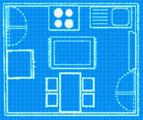
Space was at a premium in 1920s kitchens as the room hadn’t yet come into its own as the entertainment space it is today, so it was purely functional.
Back in the 1920s, space was at a premium and the kitchen was purely functional. Unless you were rich enough to have a house to rival Downton Abbey, the kitchen would have been very small as it was simply a place to cook and then clean up afterwards.
Features of a 1920s kitchen:
- Hoosier cabinets were the main focus of the kitchen, and served as an early form of a fitted kitchen, combining storage and food preparation on the fold down worktop.
- Most kitchens also had a cooker, a table and a small sink and drainer, often without running water.
- As food was bought fresh from the butchers and grocers, it was usually unwrapped so it had to be stored in jars, wooden crates or tin boxes.
- Colour schemes were subdued and practical - mainly grey, grey with green hues, white and black.
- Other than the women in the household, family members rarely entered the kitchen.
Key colours
Nothing too fancy - mainly grey, grey with green hues, white and black
1920s style picks
1920s Style Product Links
- Jelly moulds from Magpie living
- Food storage crates from Vintage Crates
- Food storage jars from Dibor
1930s
The 1930s saw the very first signs of the kitchen being more than just a place to prepare food.
Features of a 1930s kitchen:
- Breakfast bars were beginning to be introduced in more affluent homes. Smaller kitchens benefitted from models that folded out of cabinets so they could be put away with ease after a meal.
- Bolder colours, both in paint and accessories became popular, with iconic designs from ceramics designer Clarice Cliff brightening up the room. Pale green, blue and pink, and browns such as beige and coffee were very fashionable at this time.
- Bakelite, a type of plastic, was hugely popular, and was used to manufacture a range of brightly coloured kitchen items including everything from utensil handles and canisters to clocks and telephones.
Key colours
Becoming bolder with pale green, blue and pink, and browns such as beige and coffee

1930s style picks
1930s Style Product Links
- Clarice Cliff style teapot from Stoke Art Pottery
- Cream ware Canisters from Live Laugh Love
- Red Vintage Scales from Typhoon
1940s
At the start of the 1940s, the brakes were put on kitchen design and consequently usage. The Second World War meant that resources were at a minimum, so new kitchens and accessories were out of the question. The emphasis was very much on put on the function of the kitchen and home cooking, particularly with the government’s ‘grow your own’, ‘dig for victory’ and ‘don’t waste food’ campaigns, and rationing meant that the kitchen was purely used to fuel the household.
Post WWII, kitchens started to progress again and key trends of future decades were seen for the first time, such as:
- Chrome stools.
- Gingham prints.
- Tiled worktops.
- Coloured enamel appliances.
- Towards the end of the decade, dark greens, reds and whites were popular.
Key colours
Much the same as the 1930s, although towards the end of the decade, dark greens, reds and white shades were used.
1940s style picks
1940s Style Product Links
- Gingham tea cosy from Scotts of Stow
- Whitewashed Wooden Wall Rack from Magpie Living
- Stainless Steel Preserving Pan from Garden Trading
1950s
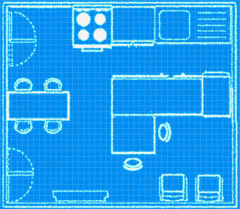
In the 1950s, there was a boom in post-war consumerism and families began to invest in their kitchens again. This was a decade of firsts and considered kitchens began to take place.
Features of the 1950s kitchen:
- Fitted kitchens, like those we’d recognise today, first made an appearance.
- Kitchens finally opened up into kitchen-diners, sometimes even opening up to the sitting room.
- The ‘50s was the first decade when the ‘American style’ really began to influence our homes. Bubble-gum colours, oversized appliances and diner-style seating areas became extremely popular.
- More conservative households stuck to a muted overall look, however, even these homes weren’t immune to a bit of kitsch, such as the iconic flying ducks on the wall!
- The colour palate of the ‘50s was ultimately ‘anything goes as long as it’s bright’! Bubble-gum candy shades of pink, blue and yellow, and the classic palette of red, white and black were immensely popular.
Key colours
Anything goes as long as it’s bright! Bubble-gum candy shades of pink, blue and yellow, and the classic palette of red, white and black.
1950s style picks
1950s Style Product Links
- Squeezy Tomato Ketchup Dispenser from Lakeland
- Oversized Pink Fridge from Smeg
- Pastel Ceramic Cups and Teapots from Oliver Bonas
1960s
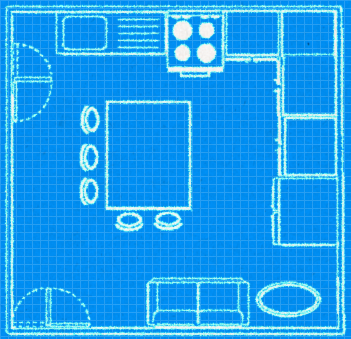
This is the decade that signified the kitchen really coming into its own as the entertainment space in the home. It became the place to socialise, rather simply a functional eating space.
Features of the 1960s kitchen:
- Kitchen islands (often complete with racking and a Lazy Susan!), which allowed the host to prepare food whilst entertaining the guests.
- Warm wood, bold tiles and funky laminate.
- The introduction of the microwave meant that cooking at home was now quick and easy.
- The inclusion of plenty of seating made it very much a communal area.
- Colour schemes included earthy brown tones alongside shades of yellow, and naturally for the era, psychedelic colours and patterns were all the rage.
Key colours
Earthy brown tones alongside shades of yellow.

1960s style picks
1960's style product links
- Wooden Lazy Susan by The Cooks Kitchen
- Eames style chairs by Fusion Living
- Olive Wood Serveware from John Lewis
1970s
The 1970s bring us even closer to the kitchen being the centre of the home, as the space grew to incorporate even larger open-plan seating and dining areas.
Features of the 1970s kitchen:
- Wood was a major design feature in this decade, with wooden cabinets, panels and even ceilings being the norm.
- Sometimes, wood was put to great effect to create a panelled dining ‘nook’ for cosy meals with family or friends.
- No surface was safe from a colour or a pattern, including appliances which often featured the insanely popular avocado green finish.
- This was the first decade where large windows were designed into the kitchen, representing the first step towards opening up the home into the garden.
- Every colour that you would never imagine would go together, yet somehow did - avocado green, orange, brown, gold and yellow were highly fashionable.
Key colours
Every colour you would never think would go together, yet somehow did - avocado green, orange, brown, gold, yellow.

1970s style picks
1970s Style Product Links
- Bodum Bean coffee maker by The Cooks Kitchen
- Vintage Bright Dots Fabric Tray by Winter’s Moon
- Orla Kiely Linear Stem Salad Bowl
1980s
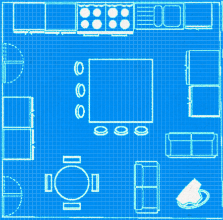
As more and more people entered the middle-classes, all of a sudden there were larger disposable incomes to dedicate to interior design. The motto of the 1980s was the bigger, the better, and this most definitely applied to kitchen design!
Features of the 1980s kitchen included:
- Kitchens became bigger than ever and took their place as the hub of the home once and for all.
- One of the key interior designers of the decade was the company, Memphis Milano, whose signature look of bright geometric furniture and patterns was once described as “a shotgun wedding between Bauhaus and Fisher-Price” – ouch!
- There were two distinct styles to the ‘80s kitchen, ‘Bold and Geometric’ and the Laura Ashley inspired ‘Country Kitchen’, which incorporated pastel cupboards, tiles and appliances, complemented with floral fabrics and accessories.
- Lovers of the bold geometric patterns went for colour schemes that included bright blue, green and red, whereas the more conservative went for the country house look of pastel greens, pinks and blues.
Key colours
Lovers of the bold geometric patterns went for bright blue, green and red, whereas the more conservative went for the country house look of pastel greens, pinks and blues.

1980s style picks
1980s style product links
- Bitossi Home Timer Pink at Heal.co.uk
- Mediterraneo Kitchen Boxes by Alessi
- Sagaform Club Wine Glasses at Debenhams
1990s
After the bold, riotous colours of the preceding decades, the ‘90s saw kitchens taking a much more subtle, minimal approach.
Features of the 1990s kitchen:
- Appliances such as dishwashers, fridges and washing machines were hidden behind cabinet panels to give the illusion they were just regular cupboards.
- This was the first decade when the idea of bringing the outdoors in became popular. Kitchens suddenly started opening up to the gardens with sliding doors and patio doors, making the most of the extra space outdoors and creating a hybrid living area.
- After the colour explosion in the 1980s, kitchens calmed down in the ‘90s with simple and elegant whites, grey and woody browns.
- Minimalist Scandinavian style was popular, especially if it had a rustic look, and pale wood furniture and white cabinets and accessories took the lead.
- Monochrome was another popular style with black granite tops making their first appearance - these were often complemented with black and white tiles and white cabinets.
Key colours
Simple and elegant with white, grey and woody browns.
1990s style picks
1990s style product picks
- Shaker Style Weathered Oak Dining Chair from Jadore Decor
- White Heart Jug from Live Laugh Love
- Joseph Jospeh Cream wooden Elevate Utensils Carousel at Debenhams
2000s onwards
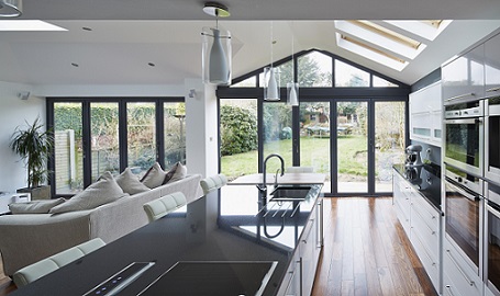
Welcome to the modern kitchen! We have certainly come a long way since the small, functional spaces of the 1920s, with kitchens now being on average 121 square foot, nearly double the size that they were back then. As a result, dining rooms are quickly becoming obsolete, with walls being knocked through to create larger kitchen diners.
Kitchens are now the room that we spend most of our time in, and are therefore designed to incorporate relaxation areas, dining areas and working areas as well as everything that’s needed for cooking.
Features of the 2000s kitchen include:
- Appliances are bigger than ever, usually in stainless steel and include range style cookers and oversized fridge freezers.
- Entertaining is the key focus of many kitchens with large islands and seating, lots of space for standing and mingling and of course, a huge dining table for dinner parties.
- The technology revolution of the 2000s onwards caused a surge in popularity for all things minimal in the home, including retro industrial touches.
- Lots of metal, wood and natural stone adds to the minimalist, natural look.
- Many kitchens feature bi-folding doors, which bring even more space into the kitchen by opening it up to the patio, decked areas and garden beyond.
A Room for All Seasons
‘Naughties’ living is undoubtedly more sociable than it used to be, and our homes reflect this. One of the best things about the modern day kitchen is that it isn’t a seasonal room. Many kitchens spill out into the garden, courtesy of bi-fold doors, making it easy to entertain friends and family indoors or outdoors throughout the year. Al fresco dining is no longer restricted to high summer, as friends can snuggle up around fire pits no matter the weather. Thanks to Jamie and Nigella, dinner parties are much more informal these days and anything goes in terms of etiquette. Staying in is the new going out, the food and drink flows readily, the playlist is bespoke and there are no last orders at the bar.
The Social Kitchen
Not only is the modern trend for maximising your kitchen space a great way to create a more user-friendly room, but it is also a brilliant way of bringing the family together (without the teenagers realising!). It isn’t unusual to have a big squashy sofa in the kitchen, along with the dining table and breakfast bar or island, creating stations for different members of the family to utilise as they will, whether it be for homework, browsing online or for the simple art of chatting, ultimately concluding that the kitchen really is the hub of the home.
Relevant Resources
- How the Kitchen became the hub of the home.
- Vintage Charm: Kitchen Style Inspired By the Great British Bake Off
- 28 Flooring Tips, Tricks and Ideas to Transform Your Home
For more information on Origin's bespoke bi-folding doors, contact your local installer today.


